


As businesses scale, data becomes one of their most valuable assets, expanding across every platform, process, and customer interaction. In today’s data-driven business environment, accurate information plays a crucial role in decision-making and long-term success. Businesses collect large volumes of data from websites, applications, sales channels, marketing campaigns, customer interactions, and operational systems. However, raw data has limited value unless it is properly organized, analyzed, and transformed into actionable insights that support smarter business strategies, improved efficiency, and sustainable growth.
This is where data visualization becomes essential.
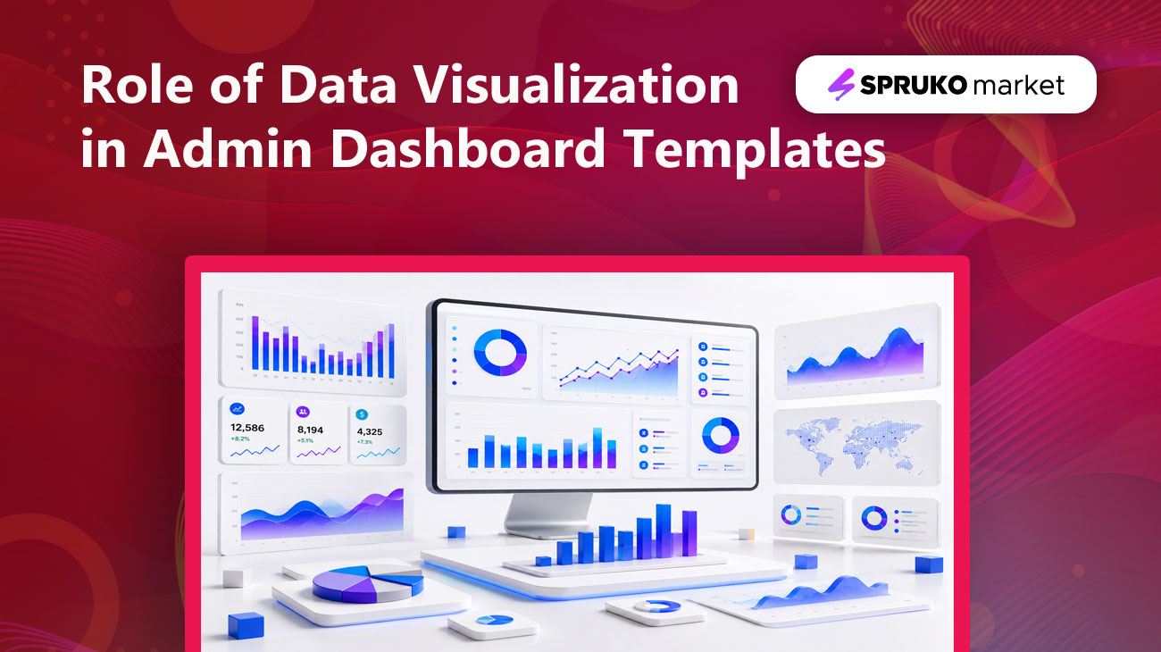
Modern admin dashboard templates are no longer just collections of tables and reports. They have evolved into intelligent business control centers, featuring charts, KPI cards, analytics widgets, and interactive visualizations that help users monitor performance, identify trends, and make faster, data-driven decisions.
For developers building SaaS platforms, eCommerce applications, CRM systems, project management tools, healthcare solutions, or financial applications, effective data visualization is one of the most important components of a successful dashboard experience.
In this blog, we will explore why data visualization matters in admin templates, how charts and KPIs improve user experience, and why analytics-focused dashboard templates have become the standard for modern web applications.
What Is Data Visualization in Admin Dashboards?
Data visualization is the representation of data through interactive charts, graphs, and analytical components that transform complex information into meaningful visual insights. It is a fundamental element of modern admin dashboards, helping organizations monitor performance, identify trends, uncover opportunities, and make informed decisions with confidence. Common visualization elements include:
- Line charts
- Bar charts
- Pie charts
- Area charts
- Heatmaps
- Progress indicators
- KPI cards
- Statistical widgets
- Interactive graphs
- Geographic maps
Instead of requiring users to analyze hundreds of rows in spreadsheets or database tables, data visualizations convert complex information into clear, easy-to-understand insights.
For example, a business manager can quickly identify declining sales trends through a line chart, while the same information may take much longer to detect in a traditional spreadsheet.
The main goal of admin dashboard visualization is simple: To transform complex data into meaningful insights that support faster and smarter decisions.
Why Modern Dashboards Depend on Data Visualization
Modern business users need quick access to accurate insights, not just raw numbers or lengthy reports. Data visualization helps transform complex business data into clear, meaningful, and easy-to-understand visual formats, allowing decision-makers to analyze performance faster and with greater confidence.
In a fast-moving business environment, users often need immediate answers to important questions such as:
- How are sales performing across different periods?
- Which products or services generate the highest revenue?
- Are customer acquisition costs increasing over time?
- Which marketing campaigns deliver the strongest ROI?
- Are support tickets, user issues, or service requests rising this month?
- Which regions or customer segments are driving the most growth?
- Are operational costs increasing compared to previous months?
Without visual dashboards, finding these answers can become time-consuming, inefficient, and prone to misinterpretation. Users may need to scan large tables, compare multiple reports, or manually identify trends hidden inside raw datasets.
Modern dashboard templates solve this challenge by presenting data through intuitive visual components such as charts, KPI cards, progress indicators, analytics widgets, and interactive graphs. These elements help users identify patterns, monitor performance, detect issues, and discover business opportunities in real time.
A well-designed dashboard works as a powerful business intelligence layer between raw data and strategic decision-making. It enables organizations to move beyond simple reporting and build smarter, faster, and more insight-driven digital experiences.
The Power of KPI Cards
Key Performance Indicator (KPI) are one of the most valuable components of a modern admin dashboard. They provide a clear, instant overview of essential business metrics, helping users understand performance without digging through detailed reports or complex data tables.
Instead of presenting raw numbers in isolation, KPI cards highlight the most important business signals in a compact and visually engaging format. They often include values, percentage changes, icons, comparison indicators, and trend directions, making it easier for users to quickly identify growth, decline, progress, or potential issues.
Common dashboard KPIs include:
- Total Revenue
- Monthly Sales
- Active Users
- Conversion Rate
- Customer Retention Rate
- New Registrations
- Project Completion Rate
- Average Response Time
A well-designed KPI section allows users to evaluate overall business health within seconds. For example, metrics such as revenue, new customers, conversion rate, and support tickets can instantly show whether a business is growing, slowing down, or requiring immediate attention.
KPI cards transform important data into clear visual signals, allowing users to understand performance at a glance. Without KPI cards, users would need to generate reports, review detailed data, and manually interpret key metrics before taking action.
By reducing manual analysis, KPI cards improve decision-making speed and help teams focus on the metrics that matter most. In a professional dashboard template, they serve as the first layer of business intelligence, providing a high-level performance summary before users explore deeper analytics.
Why Charts Matter More Than Ever
As dashboard requirements become more advanced, charts have become one of the most important elements of modern dashboard design. They help convert complex datasets into clear visual formats that users can understand quickly without scanning long tables or detailed reports.
Charts make it easier to identify trends, compare performance, detect unusual changes, and understand relationships between different data points. Whether users are tracking sales growth, website traffic, customer activity, or operational performance, visual charts allow them to interpret information faster and take action with greater confidence.
Charts are the backbone of modern data-driven admin dashboards. They transform static datasets into meaningful visual insights that enable faster analysis, smarter decision-making, and more engaging user experiences. By presenting complex information in an intuitive format, charts help organizations uncover trends, monitor performance, and respond quickly to changing business conditions.
Each chart type is designed to deliver specific insights, helping businesses analyze data more effectively and make informed decisions with greater confidence.
Line Charts:
Line charts are among the most widely used visualization tools in modern admin dashboards because they excel at displaying trends and changes over time. They connect data points across a timeline, making it easy to identify growth patterns, seasonal fluctuations, performance peaks, and unexpected declines.
Common use cases include:
- Revenue growth
- Website traffic trends
- User registrations
- Subscription renewals
- Marketing campaign performance
- Customer acquisition metrics
- Financial performance tracking
For example, a SaaS company can use a line chart to monitor monthly recurring revenue and instantly determine whether revenue growth is accelerating, slowing down, or remaining stable. Similarly, marketing teams can track website traffic trends to evaluate campaign effectiveness and identify seasonal user behavior.
Bar Charts:
Bar charts are one of the most effective visualization methods for comparing data across categories. Their simple structure makes them easy to understand while providing valuable insights into relative performance.
Common applications include:
- Sales by product category
- Revenue by region
- Customer segmentation
- Department performance
- Marketing channel effectiveness
- Employee productivity metrics
- Inventory comparisons
For example, an eCommerce business can use a bar chart to compare sales performance across multiple product categories and quickly identify top-performing products. Likewise, regional sales teams can evaluate performance across territories to determine where additional resources should be allocated.
Pie Charts:
Pie charts are designed to visualize proportions and percentage-based relationships within a dataset. They help users understand how individual segments contribute to a larger whole.
Common use cases include:
- Market share analysis
- Revenue distribution
- Traffic source breakdowns
- Device usage statistics
- Customer demographics
- Subscription plan distribution
For example, a marketing dashboard may display the percentage of traffic coming from organic search, paid advertising, social media, referrals, and direct visits. This allows marketers to immediately understand which channels contribute the most visitors.
Although pie charts should be used carefully when working with larger datasets, they remain highly effective for displaying simple percentage-based relationships and high-level summaries.
Area Charts:
Area charts combine the advantages of line charts with additional visual emphasis by filling the area below the trend line. This design helps users understand both the direction of change and the magnitude of growth.
Area charts are commonly used for:
- Revenue forecasting
- User growth analysis
- Subscription expansion
- Resource utilization
- Financial projections
- Capacity planning
For example, a cloud-based platform can use an area chart to visualize active user growth over time, helping stakeholders understand both growth trends and overall user volume.
Interactive Charts:
As business intelligence requirements continue to evolve, static charts are no longer sufficient for many organizations. Modern dashboard templates increasingly incorporate interactive charts that allow users to explore data dynamically and uncover deeper insights.
Interactive visualizations enable users to:
- Filter data using custom criteria
- Zoom into specific time periods
- Compare multiple metrics simultaneously
- View detailed information through tooltips
- Drill down into granular datasets
- Switch between different reporting perspectives
- Analyze trends across multiple dimensions
For example, a sales manager may begin by viewing annual revenue performance and then drill down into quarterly, monthly, or daily sales data with just a few clicks. This level of interactivity provides a more flexible and efficient analytics experience.
The Business Impact of Chart-Based Dashboards
The value of charts extends far beyond visual appeal. Effective chart-based dashboards help organizations improve operational efficiency, accelerate decision-making, increase data accessibility, and reduce the time required to analyze business performance.
By presenting information visually, charts enable organizations to:
- Monitor key performance indicators in real time
- Identify trends before they become critical issues
- Discover growth opportunities faster
- Improve collaboration through shared insights
- Make data-driven decisions with greater confidence
- Reduce reliance on manual reporting processes
Ultimately, charts serve as the bridge between raw data and actionable business intelligence. They transform complex information into meaningful insights, enabling organizations to operate more efficiently, respond more quickly to changing conditions, and make smarter strategic decisions.
This is why charts have become an essential component of modern admin dashboard templates and continue to play a vital role role in the future of business intelligence, analytics, and data-driven web applications.
How Analytics Improves Business Decision-Making
Analytics is the process of transforming raw data into meaningful business insights that support smarter, faster, and more confident decisions.
A dashboard without analytics functions only as a reporting interface. However, a dashboard powered by analytics becomes a strategic decision-making tool that helps organizations understand performance, identify opportunities, and respond proactively to business challenges.
Modern organizations use analytics to:
- Identify new growth opportunities
- Reduce operational costs
- Improve customer experiences
- Predict future trends
- Measure business performance
- Optimize marketing campaigns
For example, an eCommerce dashboard can reveal high cart abandonment rates, best-performing product categories, seasonal purchasing trends, and customer lifetime value patterns.
These insights help businesses take immediate action, improve performance, and make more data-driven decisions.
The Relationship Between UX and Data Visualization
Great admin dashboards are not just designed to display information; they are built to communicate insights clearly, quickly, and effectively. A well-structured dashboard helps users understand complex data without confusion, while poor visualization can create information overload, reduce productivity, and lead to slower decision-making.
Effective dashboard UX depends on several important principles:
- Simplicity: A dashboard should present data in a clean and focused way. Unnecessary elements, excessive charts, and complex layouts can distract users from the most important insights. Users should be able to understand critical information within seconds.
- Visual Hierarchy: Important metrics should be placed where users can see them first. Primary KPIs, performance summaries, and key alerts usually belong at the top of the dashboard, while supporting charts and detailed reports can appear below. This helps users move naturally from high-level insights to deeper analysis.
- Consistency: Charts, colors, typography, spacing, icons, and component styles should remain consistent across the dashboard interface. Consistency improves usability, creates a more professional experience, and reduces the effort required to understand different sections of the dashboard.
-
Accessibility: Modern dashboards should be usable by all users, including people with visual impairments or different viewing needs.
- High contrast ratios
- Readable typography
- Color-blind-friendly visualizations
- Responsive layouts
- Clear labels and tooltips
- Keyboard-friendly navigation
When UX and data visualization work together, dashboards become more than reporting screens. They become intuitive, insight-driven experiences that help users analyze information faster and make smarter business decisions.
Industry Use Cases for Dashboard Visualization
Dashboard visualization plays an important role across different industries by helping teams monitor performance, understand user behavior, and make faster data-driven decisions.
- SaaS Applications: SaaS dashboards help product teams, founders, and customer success teams track essential product and subscription metrics, such as user engagement, subscription growth, churn rate, feature adoption, and customer retention.
- eCommerce Platforms: eCommerce dashboards give store owners a clear view of revenue, orders, product performance, customer behavior, inventory trends, and sales opportunities across different channels.
- CRM Systems: CRM dashboards help sales and support teams visualize lead conversion, sales pipelines, team performance, customer interactions, follow-ups, and deal progress in one centralized interface.
- Financial Platforms: Financial dashboards simplify complex financial data by visualizing cash flow, profit margins, expenses, revenue forecasts, investment performance, and overall financial health.
- Healthcare Solutions: Healthcare dashboards support administrators and medical teams by presenting patient statistics, resource allocation, operational efficiency, appointment trends, and performance metrics in a structured visual format.
Key Features of a Modern Data-Driven Admin Dashboard Template
When choosing a modern admin dashboard template, it is important to focus on features that improve usability, scalability, and data interpretation. A powerful dashboard template should not only look professional but also help users analyze information faster and manage business operations more efficiently.
Important features to look for include:
- Interactive charts
- Real-time analytics
- Responsive layouts
- KPI widgets
- Dark mode support
- Multiple chart libraries
- Advanced filtering options
- Cross-browser compatibility
- Data export functionality
- Mobile-friendly dashboards
Templates with these capabilities offer greater long-term value, flexibility, and a better user experience across different business applications.
Why Businesses Prefer Analytics-Driven Dashboard Templates
Businesses increasingly prefer analytics-driven dashboard templates because they provide more than basic interface design. They help organizations transform data into actionable insights, improve visibility, and make faster, more confident decisions.
Key benefits include:
- Faster decision-making
- Improved operational efficiency
- Better user engagement
- Increased productivity
- Enhanced reporting capabilities
- Greater visibility into business performance
In competitive markets, quick access to accurate insights can create a strong business advantage. Organizations that make data-driven decisions faster are often better positioned to improve performance, identify opportunities, and respond effectively to changing market conditions.
Why Choose SprukoMarket for Modern Admin Dashboard Templates
SprukoMarket dashboard templates are designed to help developers build modern, data-driven web applications faster. With clean layouts, analytics-ready components, and performance-focused structures, our templates make it easier to create professional dashboards for real-world business needs.
SprukoMarket templates offer:
- Modern and professional admin dashboard UI designs
- Ready-to-use dashboard pages and layouts
- Built-in charts, KPI cards, and analytics widgets
- Responsive admin panels for all screen sizes
- Developer-friendly template structure
- Reusable UI components for faster customization
- Dark and light mode dashboard options
- Performance-optimized layouts for smooth admin experiences
Whether you are building a SaaS platform, CRM system, eCommerce dashboard, enterprise admin panel, or analytics application, SprukoMarket templates provide a reliable foundation for turning complex data into clear, actionable insights.
Final Thoughts
Data visualization has become the heart of modern admin dashboard design. It simplifies complex datasets into clear, easy-to-understand visual insights. Charts, KPIs, and analytics are no longer optional features; they are essential tools that help users understand information, identify trends, and make smarter decisions.
As businesses continue to generate increasing volumes of data, the demand for intuitive, analytics-driven dashboard templates will only continue to grow. The most successful dashboards are not those that display the largest amount of data, but those that present the right information at the right time in the clearest and most actionable way.
By combining effective visualization, strategic KPI tracking, and actionable analytics, modern admin dashboard templates empower organizations to unlock the true value of their data and drive business growth with confidence.
